

I’ve met too many clients to mention that start the conversation ‘I love colour but…..’
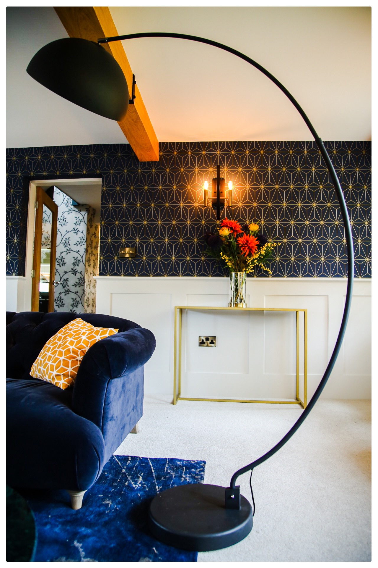
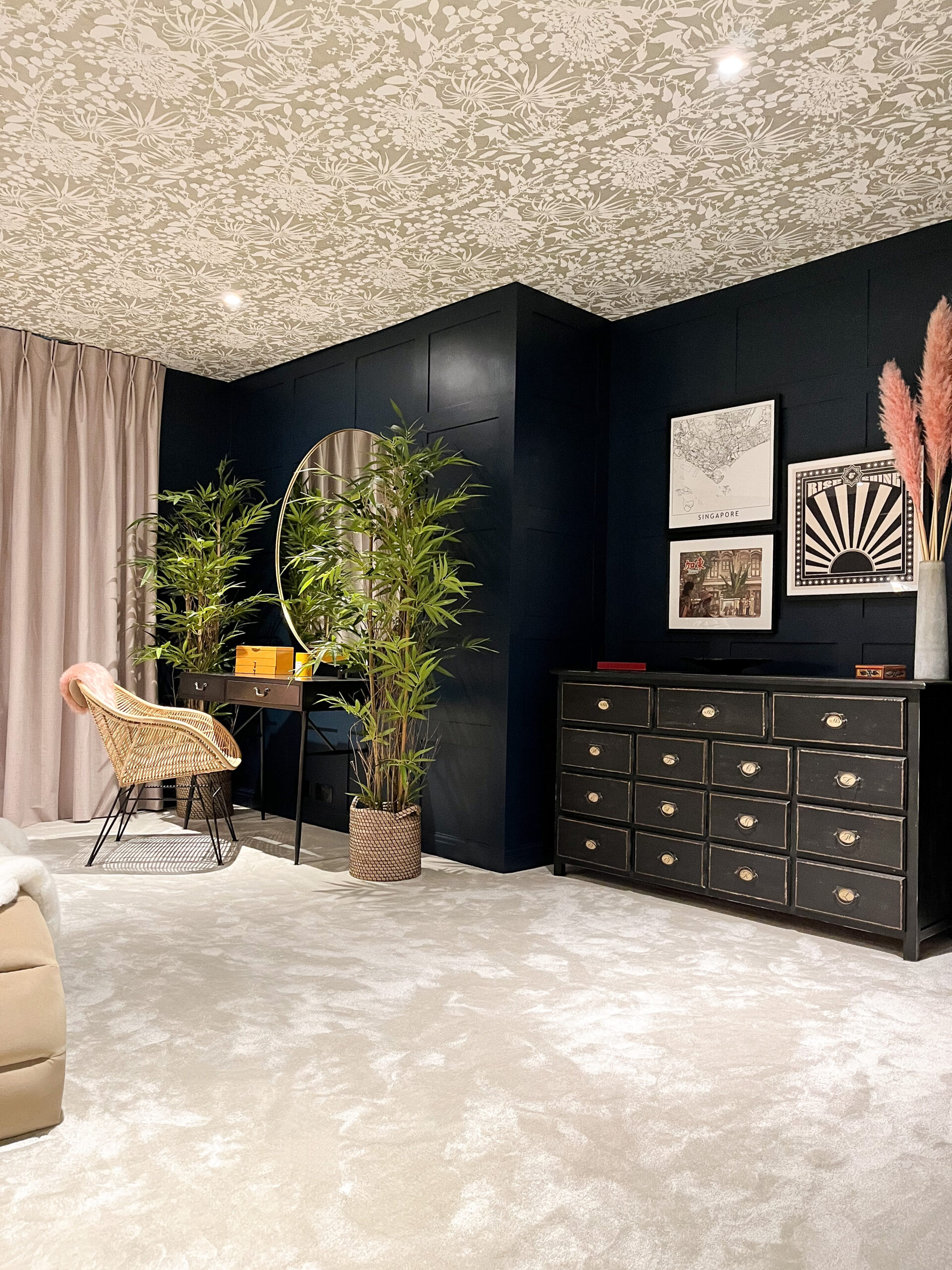
Said clients, often have elaborate Pinterest boards featuring colourful room designs but when it comes to the crunch, often opt for neutral colour schemes. Understandable. I struggled with injecting bold colours into my home until becoming an Interior Designer. I always thought dark colours would shrink a room or feel ‘heavy’ or I’d get bored quickly. In fact, the opposite is true to each of those; My dark blue living room looks bigger & more spacious whilst feeling cosier, the deep green bedroom feels opulent & I’m sleeping so much better (coincidence?!)
Generally, my advice would be please don’t be frightened of colour, embrace it. Introducing colour can invigorate, relax, energise the soul & give each space within your home a dash of personality. Start small to begin with, it soon becomes obsessional!
Below are my top tips for introducing colour into your home:
1. Introducing Colour – Balance
A deep or bold colour can be balanced by a neutral. If you opt for a darker colour sofa, then pale cushions & throws will add softness. Deep colours on the wall can be balanced by paler wall art, paintings in white frames or with a wide, white mount. Alternatively, if the room has features such as a picture rail, daido rail or panelling, a darker colour can be used on the wood work with pale wall or vice versa. A curve ball idea, (which I love) is to keep walls pale & opt for a deep colour on the ceiling. The drama it creates is fabulous!!
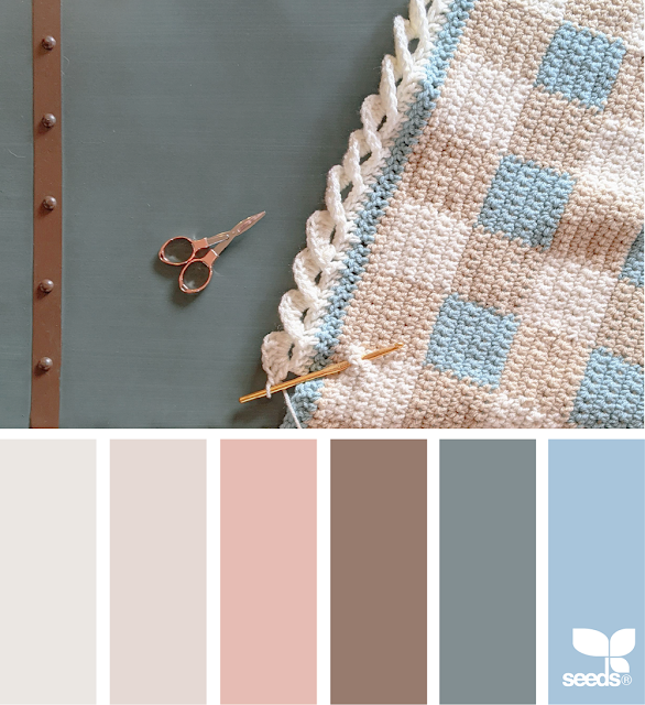
2. Introducing Colour – Tints, Tones & Shades
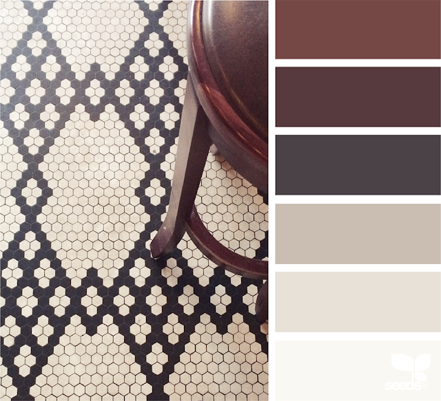
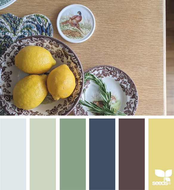
Essentially, without going into a rabbit hole about the science of colour, the basics are to pair your colour with another colour on the colour wheel, within the same ring (i.e tonally similar – so the same amount of grey is added to each colour).
Pinterest is a brilliant source for finding help with colour schemes & I particularly love the Design Seeds Colour from Nature palettes. A good quality paint centre should then be able to help with colour matching!

3. Introducing Colour – Think in 3’s
Interior Designers love the number 3; 3 pendants over an island, groups of 3 accessories on a shelf for example. The count of 3 also works when introducing colour; A base colour (70%) A secondary colour (25%) and an Accent colour (5%). This percentage split works well.
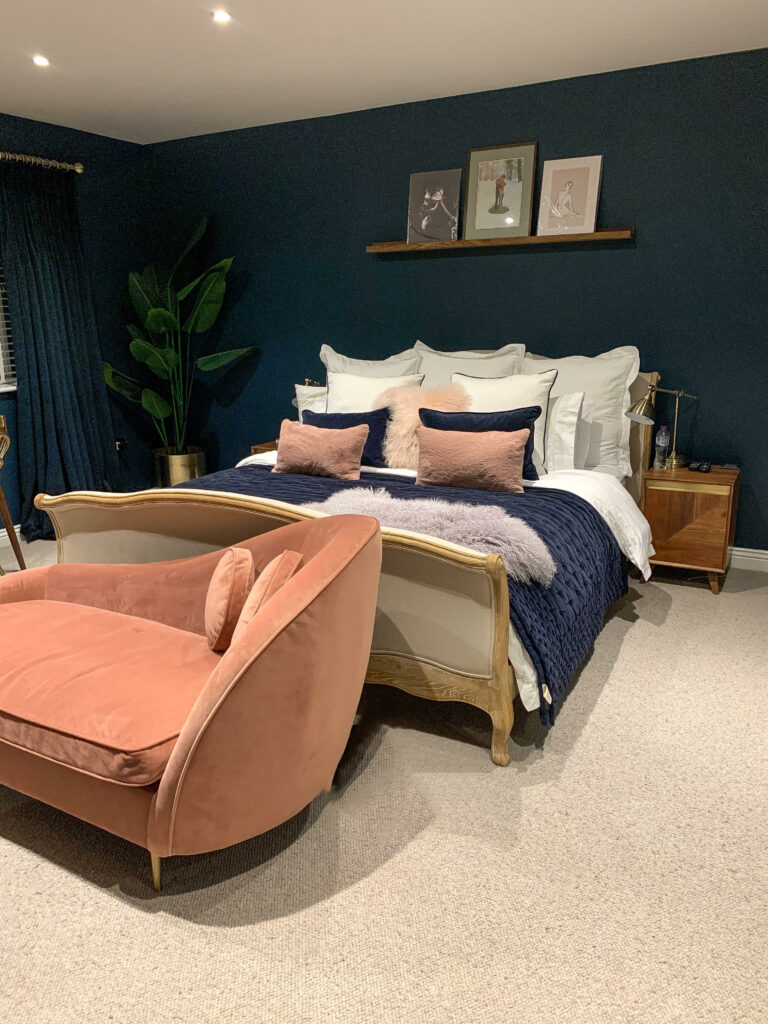
Deep Blue Base colour, White Secondary, Blush Pink Accent
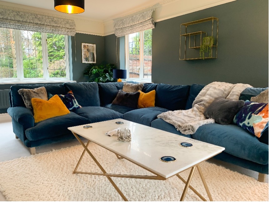
Green / Blue Base Colour, White Secondary, Ochre Accent
Hope this Blog helps you but in essence, be BRAVE & go for it..
Lots of Love
Jane x